Our home is looking pretty tired; most of it was decorated about 7-8 years ago, but with two children growing up and an excited sausage dog, it is in desperate need of a re-vamp. I’ve hated the midcentury lounge for as long as I can remember; it had one large light teal wall, with the rest white which I loved at the time. But for ages it has seemed really bland, and with the arrival of our orange Habitat velvet sofa, it really looked like it needed some attention. As dark colours have been in fashion for ages, I had been trying to convince Adam for what felt like years, to go dark blue. Really, really dark blue.


Finding the perfect dark blue was hard. I set to Pinterest to research colours – and it appears dark blue walls and orange sofas are pretty popular so I made a whole board of them! But there is navy, and bright blue, purple tone blues, and green teals – I bought so many tester pots. I then discovered Annie Sloan’s Napoleonic Blue which is slightly brighter than I wanted but it had such a strong tone similar to some I had seen on Pinterest I couldn’t wait to try it, and to discover that it was “the one”.


Our midcentury lounge is large – it is a double room knocked into one, sometime in the 1960s, so I felt that it would be too much for the whole space. The other end of the room needed an identity – I wanted a study area for everyone (me!) but Adam wanted a cosy corner near the 1930s wood burner. The practical option won, and we now have my desk (a 1970s G Plan dressing table with the mirror removed) at one end.

The blue paint colour really works and seems to change throughout the day. The room is north facing so very dark most of the time with little light early on. At this time it feels slightly purple in tone, much brighter – then seems to go darker by the evening. I love this effect. We also used it for the radiator and skirting boards – we didn’t want to break up the colour with a neutral such as white which we are really pleased with. It is funny how we are all programmed to paint skirting boards and architraves white but by not doing this, the walls look taller.

We chose another Annie Sloan paint for this end; Paris Grey, which has a slight mushroom tone to it making it feel warmer than some greys. We took ages to decide on the colour for this half – creams, beiges, browns, ambers all felt wrong. I wanted something a bit stronger to be honest such as a burnt orange, but got over ruled which I am now glad about!


The room has been finished with B&Q bamboo flooring in a dark brown. We have had painted floor boards forever, making the room feel cold plus they were a nightmare to keep looking nice. I am so happy with the floor – it is easy to scratch so if you get any please put sticky pads on the legs of all furniture. It finishes off the midcentury lounge feel perfectly.


We chose dark wood Venetian blinds from Dunelm for the 3 windows – one is is slightly short but we didn’t want to buy bespoke! They look really smart and match the mid century teak furniture brilliantly but beware, they get so dusty!


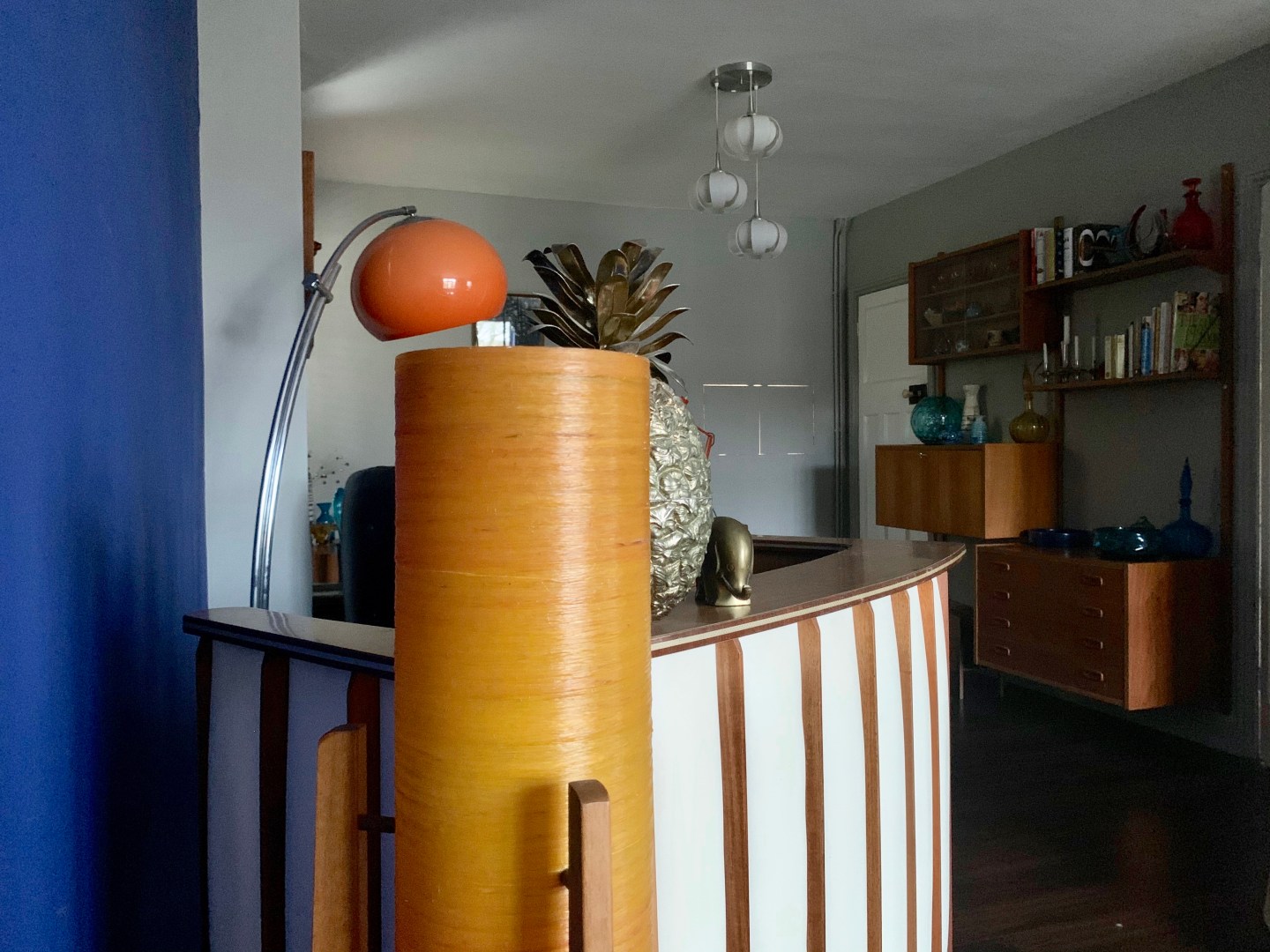
The rest of the room was filled with our vintage midcentury lounge furniture – a PS System wall storage unit that floats off the floor, a G Plan Astro coffee table, swivel chairs that Adam’s grandma bought in 1968, a teak radiogram and a 1950s bar.


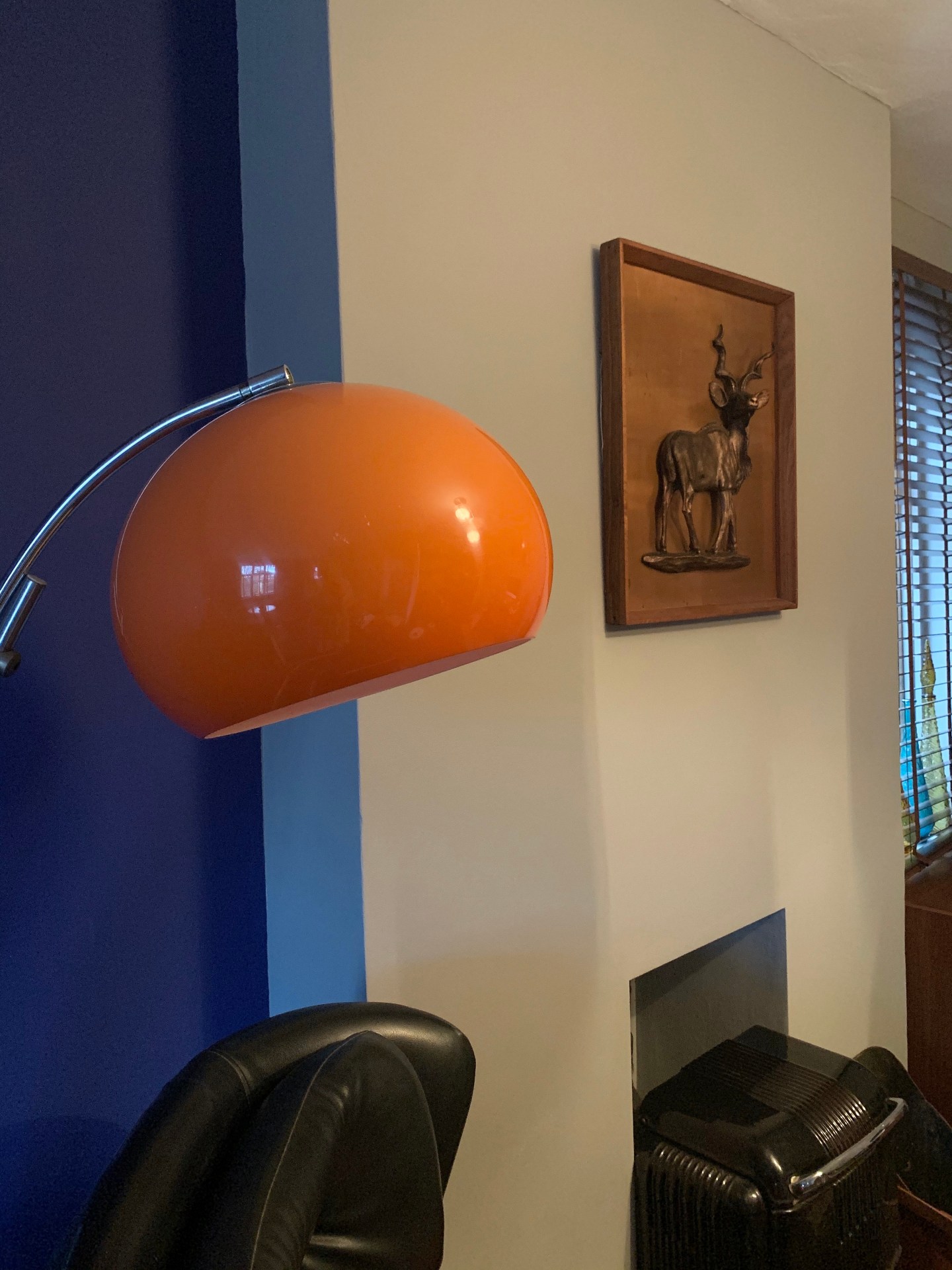
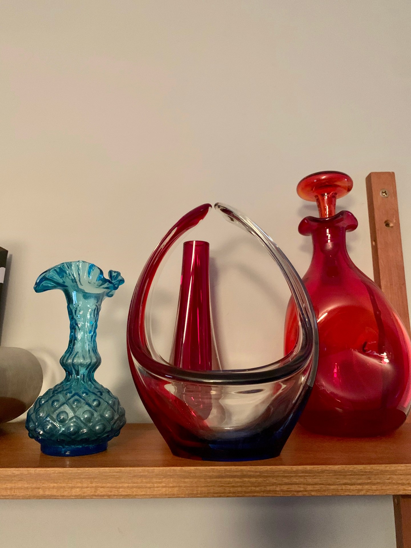
All the decor is vintage – from the West German pottery to the Italian Murano and English Whitefriars glass. Adam suggested that we sold the orange rocket lamp but he was shouted down!


The rugs are 1970s Rya rugs – we are on the look out for another large one for the study end, as these ones are quite small.

Finally, we created small collages of prints, plates, shelving and even a teak barometer to break up the walls. I want to add one more print behind the bar beside the giant orange lamp, but none of our current ones work. The Tretchikoff is too green and the Lynch too battered so we will wait to find the perfect one.


Finally, I wanted to tell you a bit more about the paint that Annie Sloan kindly gifted us. It goes on so well, and only one coat created this strong finish. The depth of colour is great too, and I am so pleased I chose a slightly brighter blue than I originally wanted. Everyone has loved it so far (except the cleaner who told me that she wouldn’t have chosen this colour – I asked her what she’d have chosen. She told me cream!) and we are so happy. Our mid century lounge is now a grown up space, warm and cosy, and looks great with the hero piece – our orange velvet sofa.

This contains affiliate links. The paint was gifted – but all opinions are true.

