Here is our latest article for Vintage Life Magazine called “Flat-pack backlash”. Why not have a read……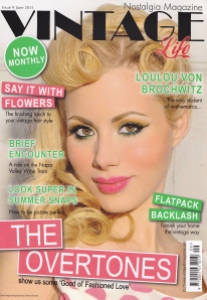
The Flat-pack Backlash!
Today’s modern furniture comes in a flat box with an Allen key and a set of instructions. Often the end result is a flimsy, soulless cabinet which is the same as everyone else’s. Maybe it’s time for a flat-pack backlash? 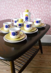
As it’s the 60th anniversary of the Festival of Britain this May, where we showcased to the world that British design was innovative, contemporary and beautiful… lets look back and fall in love again with mid century furniture appreciating it’s history, sturdiness and sleek design.
The 40s:
In 1943, the government outlined the exact specification for furniture made during the war. In a time when bombed houses were being rebuilt and many newly weds were setting up home, they formed a committee of influential designers, to create the Utility Furniture Catalogue. They dictated the design, material and even which screw should be used. The designs were simple, functional alluding to the Arts and Crafts movement. Cabinets sat on plinths rather than legs, handles were wooden as metal was scarce and most were made from strong oak and dark mahogany. Even though the committee saw this as their big
chance to influence the country with “good design”, most pieces were plain, looking to the past rather than the future.
The 50s:
Enjoying a growing sense of optimism and freedom, we now demanded a change in our homes. The Utility dark wood was seen as gloomy, the design drab and with aluminium, fabric and light wood becoming readily available again it seemed that a change was needed in furniture design. 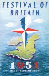
In 1951, the Festival of Britain on London’s South Bank was a real turning point. It’s aim was to create a feeling of recovery and inspire better design for new towns being built. 8 million visitors came to see contemporary architecture, industrial and furniture design. Room sets were created with modern furniture offset against the new fabrics and prints of the day. The wood had turned light overnight, with English elm and light oak being the favourites. Legs on all furniture were thin and splayed making them seem to float off the
floor. Chairs and tables were curved and traditional styles reworked into the new look. Ercol was one of the key players with their simple yet elegant Windsor chair, dining tables and sideboards.
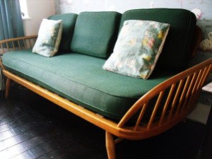 Ercol’s elm is a great range to collect now as it sits perfectly in both a modern or classic setting. The iconic butterfly chair (1958), the nest of pebble tables (1956) and the day bed are ones to look out for.
These new styles were labelled “contemporary furniture” and for the first time since before the war the chair you sat on revealed your status. It was quite expensive so in reality only middle class families bought it, with the higher classes preferring Heals and Harrods. Furniture retailers chose not to sell it as traditional styles outsold it, so it was left to the independents.
The 60s:
The 1960s saw the rise of teak furniture from well respected manufacturers such as G Plan, Nathan and McIntosh. They made functional items such as sideboards but gave them a contemporary feel with extra width (some were up to 7 foot), integrated handles and a gloss finish. Adverts sprung up, creating an aspirational world of men drinking cocktails
in the lounge, ladies putting on lipstick in the bedroom. Before this, adverts were about the room set now it was about the lifestyle. Styles were popular through the 1970s with G Plan becoming one of the first companies to sell mass produced furniture. 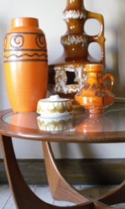
Teak furniture now looks great in a modern home with it’s clean lines and simplicity. With a cream wall and a stained floor, a 60s sideboard or coffee table will look as contemporary now as it did then.
However, this modern style, whether in elm or teak wasn’t to everyone’s taste. The baby boom generation, leaving the family home in the late 60s rejected this “contemporary furniture” as being outdated. They saved up for one key piece such as a Sanderson sofa with William Morris fabric or a Habitat chrome glass table.
 Interestingly they now inherited their grandparents utility furniture and up-cycled it to give it a new fresh, modern look. Tables were painted in black or white gloss which sat perfectly underneath funky coloured glass, proving that the designs had passed the test of time.
What is clear is that through the mid 20th century, furniture kept reinventing itself under the name Contemporary, with each decade and generation rejecting what came before. These pieces have become collectable and ironically the flat packers are alluding to these
styles now. Whether you up- cycle some utility or hunt down a Nathan, surely its worth the effort to create an individual look that’s not the same as your neighbours! 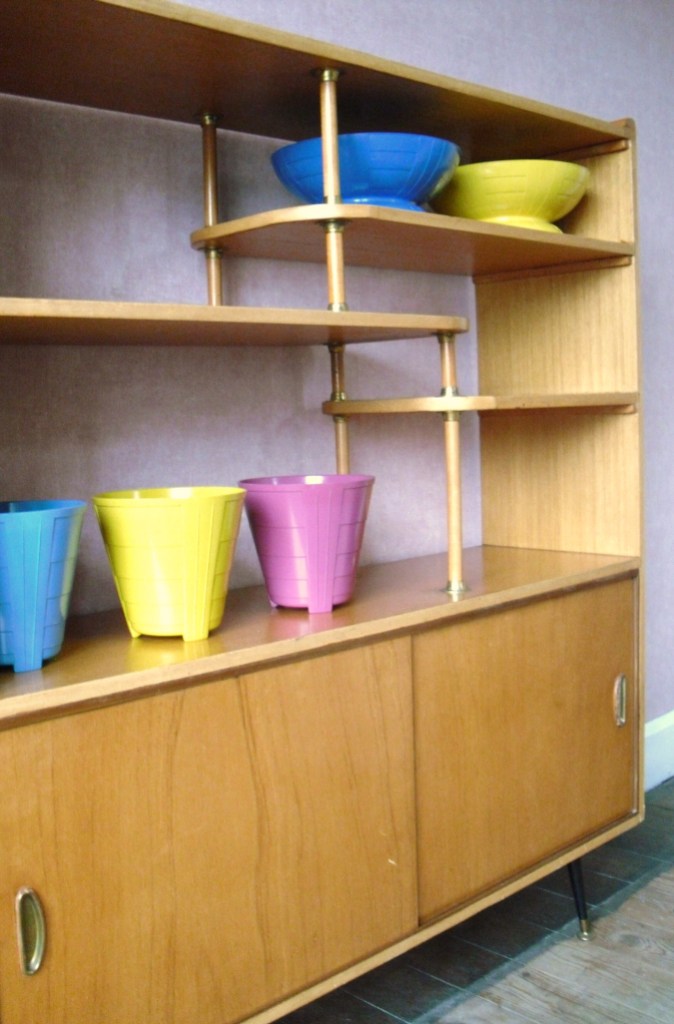

50s furniture is my favourite! Though I do have the exact same bright orange Scheurich in your 60s picture. Emma
Author
Gosh, we have the same taste! I love 50s furniture too but alas our house is abit too 60s for my liking!!!! We have a great formica top table and sideboard..the top is bright blue with black and gold splashes all over! They are going into the kids playroom though as even they cant destroy them!
Kate