Any regular readers of our blog will know we have bought a Patterned Palace which we are totally renovating. Every wall and floor was covered in retro patterns..some good and some darn ugly! Slowly we are ripping it out and replacing it with, to be fair, not that much pattern. 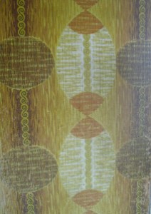
I love wallpaper and prints but I find it hard to mix them together with all our treasures to make a calm, stylish finish. There is definitely a fine art to it.
Which this couple, in my opinion, have nailed. Heather from Eclectic Chair (remember those gorgeous cushions featured some time back in Beat the Monday Blues, Part 1) has shared her home with us today.
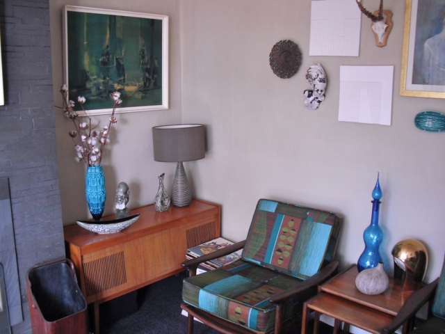
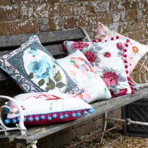 Her and her partner have successfully mixed patterned walls with patterned furniture, cushions and prints. The result is fantastic.
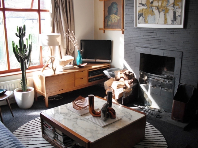
I personally love their style and our lounge which is nearly complete, has similar objects in it to theirs. I love the prints on the wall, especially the Tretchikoff Green Lady (which I have been after for years). I love the medicine bottle (I have literally hundreds of these..well about 15!).
She describes her home, “It is a joint effort, my partner spends just as much time scouring Ebay and charity shops as me! It’s a compromise between both our different styles, I try to reign in his masculineness, and he reigns in my girlyness, and the result is pretty good”
I agree! What they have done well is choosing one base colour which is in the pattern as well as the furniture or floor. Then add accent colours: I love the orange in the office area and the blues in the lounge. See for yourselves and let me know what you think!
 For more information on Eclectic Chair visit their website and Facebook page




It’s no surprise that Heather and Cleave’s home looks like it’s come straight out of an interior design magazine. They’re a very handsome, stylish couple. 🙂 Heather’s mum also has a home that’s incredibly beautiful so it must run in the family! My favourite room is the office. The geometric wallpaper mixed with the bright ‘pops’ of orange are truly fabulous! It takes confidence to dress a room with such a wild mix of textures and pattern, but it just goes to show that it can be done – and how!
Author
Well said…you should have written this for me as you have EXACTLY described what I was thinking xx
I’m waiting to see how your own renovations are going. Has Heather inspired you do mix things up a bit? You have great style anyway. I’m just a nosey old bird!!! hahaha! 🙂
Hey Louise, thank you! Especially for the handsome couple bit! And you remember my picture of my mum’s house on my old website! Yes, my mum really has been a huge influence on me. I always thought her house should be featured in a magazine, I even sent some photos to Country Living on her behalf! Hope to see you soon, New Years Eve? xx
Author
Oh share a photo of her home with us Heather!! Renovation going slowly, lounge nearly finished. We have lots of retro prints for the wall….I love them but sometimes I look at them and think they are so “themed” …kinda kitcsh overload. I suppose its all in the positioning! and being brave! prob having an orange and blue rooms a bit brave anyhow! (Oh and whats happoening new years eve!!!!))
Beautifu home-thanks for sharing
Betty
x
Author
Wish my home looked liked hers Betty..Im a white walls girl as I have som much “stuff” I always feel if I add pattern it would be overload…but Heather has shown that not to be the case!
You just need to make sure that you have modern stuff in the mix so that you don’t have a retro overload. I will share some pics of my mum’s house on my Facebook page soon, and Louise and I have a mutual friend who we have spent the last few NYE’s with in Manchester x
Author
ah we have NO modern stuff in the lounge! just the telly! Thats where we are going wrong!
This looks lovely, really interesting mixture of stuff and was fun for me to spot things that we also have or have had over the years: West German pottery and mid century glass particularly! Emma 🙂